SANTIAGO BRUNI


My name is Santiago Bruni, and I’m an Art Director and poster illustrator based in Buenos Aires, Argentina. I studied Advertising at Miami Ad School, where I was nominated for awards like D&AD New Blood and won the Top Dogs Awards. I’ve worked with brands like Netflix, Shudder, AMC, MUBI and E!, and I’m currently a Visual Designer at Boogieman Media and artist at Hero Complex Gallery. As a huge pop culture fan, I bring passion and storytelling into every project I create.
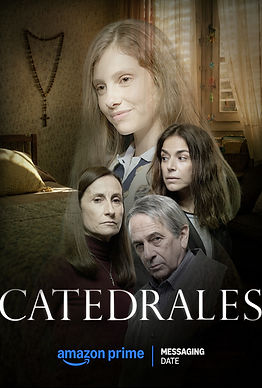
Working with Dog Docks on the launch campaign for Catedrales, we developed a series of posters exploring the contrast between past and present. By portraying the same family across both periods and using distinct color palettes to differentiate each era, we created a visual system that connected the characters while emphasizing the passage of time.
This was a really cool project as I really got to do a buch of different options all with very different styles. In the end, these were the ones that made it to the final round.
The goal was to build a cohesive series in which color and composition helped communicate the relationship between the two timelines, giving the campaign a distinctive visual identity.